Epoch serves as a QA testing platform, aiding game studios in more efficiently testing their products during development. By doing so, it not only saves studios hundreds of hours but also tens of thousands of dollars.

Client
EpochML
Feb 2021 - Feb 2022
Position
Product Designer
Company Size
3 Engineers
2 Founders
2 Consultants
Responsibilites
UI / UX
User Resesarch
Prototyping
Design Thinking
Information Architecture
Journey Maps
Workflows
Problem
The process of game development is often characterized by its inherent chaos, as it involves the utilization of numerous diverse tools and the challenge of seamlessly integrating them all.
Brief
Epoch aims to establish a user-friendly and convenient platform that encompasses essential game testing elements such as planning, sharing, testing, reviewing, and automating tests.
Goals
Convenience: Streamline access to insure continuous and engaged usage to enhance product success.
Communication: allow effective and transparent communication for complete clarity and ease of tension
Aesthetics: Create an accessible application that users of any generation can navigate
Industry terms
Builds
A build represents the most recent iteration of a game. The frequency of updates to builds can range from once a day to multiple times per day, depending on the scale of the game studio. Once the most recent build is deemed satisfactory, it is passed on from the development team to the QA lead. The QA lead then assigns tasks to the build and subsequently shares them with the testers for further evaluation and testing.
Test Run
Upon receiving the latest build, the tester proceeds to download it and activates a screen recorder. They begin testing with the intention of actively seeking bugs relevant to their assigned task. These tasks can vary in duration, ranging from 30 minutes of gameplay to approximately 4 hours. Whenever an issue is discovered, the tester records the following details: how to reproduce the issue, frequency of occurrence, issue severity, issue type
Issue Reviews
Once the tester's annotations are received, the QA lead carefully reviews the notes to assess whether the raised issues are genuine bugs or false alarms. This determination is made based on the judgement of the QA lead. If a bug is confirmed, it is logged into a software tool like Jira as a reported issue. The development team then addresses the identified issues and updates the build accordingly. Subsequently, the previously reported issues are retested to verify whether they have been successfully resolved.
Interviews
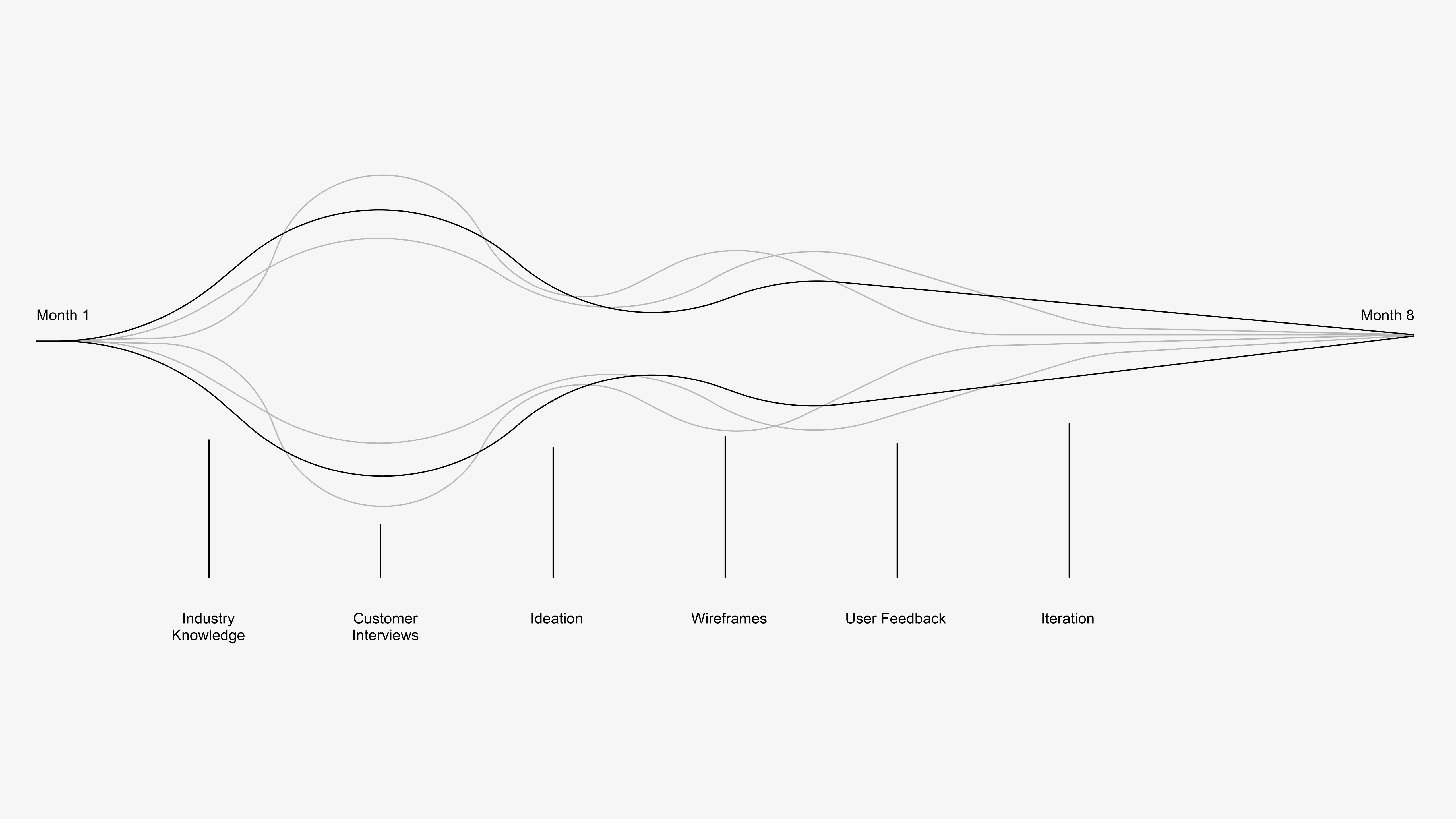
To better understand and gain empathy for our target groups (game testers, qa lead) I proceeded in conducting research through three design methods: semi-structured interviews, and personal inventory.
Semi-structured Interviews
Our team conducted multiple interviews and framed questions to allow for conversation that provided insights into the feelings and experiences associated with care. We then analyzed responses to find a general pattern from these interviews. One interesting thing that we found out is that children and parents tend to communicate more often and even felt closer to each other while they are away from home.
Personal Inventory
Each participant was asked to bring an item that reminds them of their loved one's care and explain the significance. As participants explain the significance of the item to better reveal how care is shown within the relationship. Our team found that people feel stronger emotions with items that are tangible and items that associate with events that are emotional, which could be happy or sad.
User Personas
The Scrambled Game Tester: Wants a better experience for how they do game testing, an easier way to record issues and use fewer tools.
The Disorganized Lead: Wants an easier way to manage/track their game testers, share progress with studio heads, and easily make modifications to their test plan.
User Feedback
I conducted a usability test with four different participants and continued to develop and refine the overall product through user feedback.
Usability Testing
In asking questions that focused on the product's form, function, and overall experience, I was able to gain further insights regarding how our users would use and integrate in their lives and workflows.
Tester Takeaways:
• Wants to be able to add more types of information rather than just a text box.
• Wants annotations to not be boring, but fun.
Admin Takeaways:
• Wants to be able to upload their test plan for the game.
• Wants to be able to see what hardware specs the tester was using.
• Wants to be able to assign multiple smaller tasks to a build instead of one big one.
• Wants to easily be able to create a ticket to send bugs off to dev seamlessly.
• Wants to be able to review all issues across different builds at one time
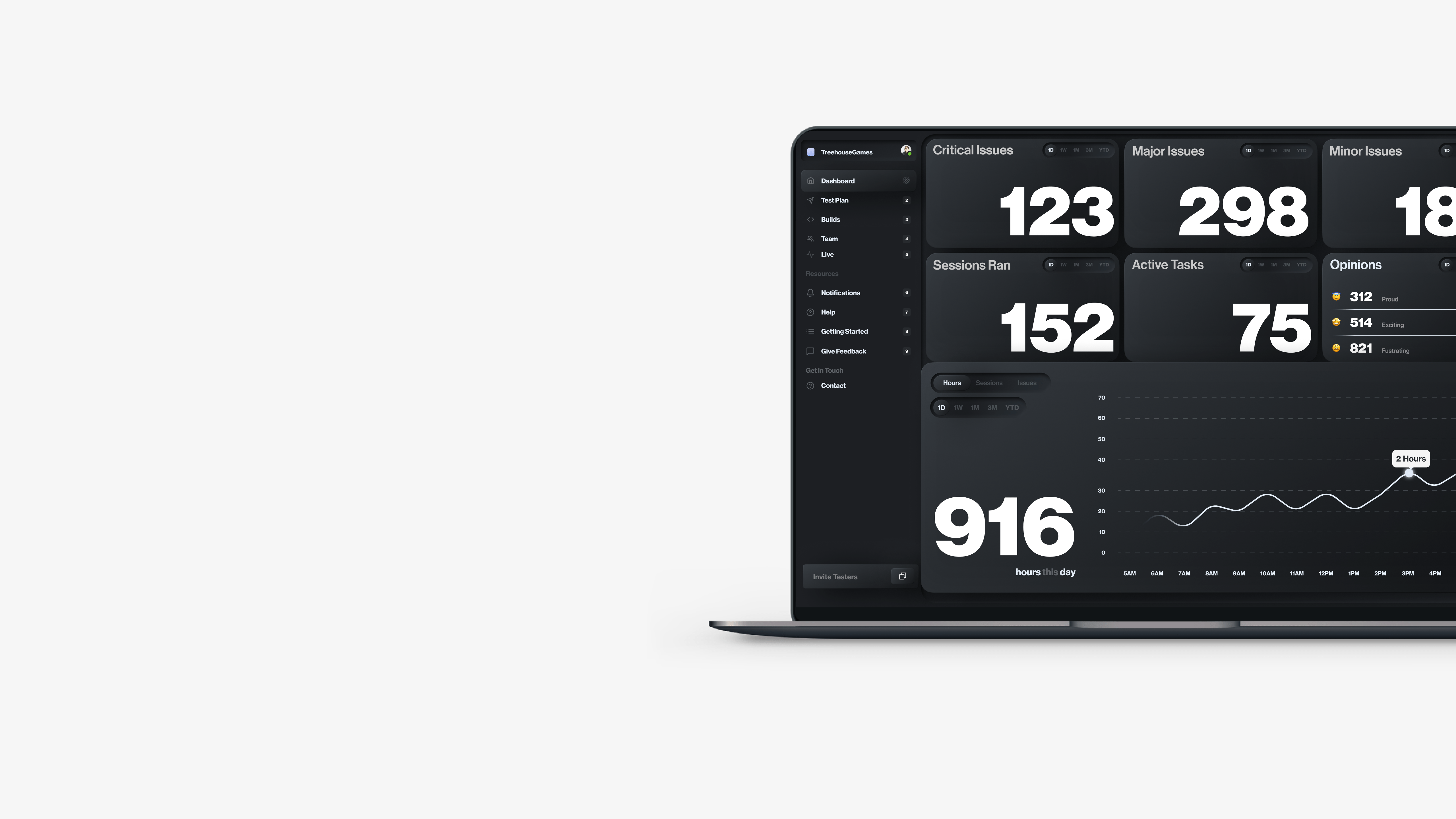
Dashboard
Have easy high level access to everything that has been happening with game to insure things are going according go plan.
Build Management
Where all builds are managed and maintained. Once a build is uploaded, tasks can can assigned to that build, along with testers as well allowed leads to do everything in one screen.
Annotation Review
There screen where the QA lead would review issues that the tester found along with details of the hardware they were using. If the QA lead decided this was a bug they could one click and create a jira ticket for development, or simply dismiss the issue.

Team Management
This screen allows for the QA admin to review stats about their testers that they simply wouldn’t have access to before hand. Sometimes game studios would simply just outsource QA testing and then get hit with a bill for X hours, with a rough breakdown on where those hours went, and no way to prove if this is true or not.

Test Scheduling
This screen allows for QA leads to be able to plan their tasks well in advance so that when a fresh build comes from development, they can easily upload it here, and quickly assign pre-populated tasks they have scheduled for the day.

Test Plan
This screen is simply just a google sheet. Didn’t want to try and reinvent the wheel here. Almost every QA lead I spoke with had their test plan in a good sheet, so I wanted this to have a similar UX pattern to what they were used to. These datasets can range from 500 - 3000 entries, which means we needed a powerful filtering system so our users can easily find what they are looking for.

Test Plan - Filters
We allowed our users to create custom filters that they could save for easy access in the future. This allowed our users to surface up rather quickly the task that they are looking for without having to scroll through hundreds or thousands of entries which would be a nightmare.
Test Plan - Filters
We allowed our users to create custom filters that they could save for easy access in the future. This allowed our users to surface up rather quickly the task that they are looking for without having to scroll through hundreds or thousands of entries which would be a nightmare.